From augmented reality in the front window at Zara, to a litter of puppies on show at Saks Fifth Avenue — companies go weird and wonderful to draw passers-by into their shop. But when it comes to visual merchandising for a fashion boutique, the window display needs to represent the superiority and luxury of the clothes in-store. So how can this be achieved? We investigate the psychology behind window dressing and gather some insights from Trilogy Store — retailers of Paige Jeans online and through stores in London.

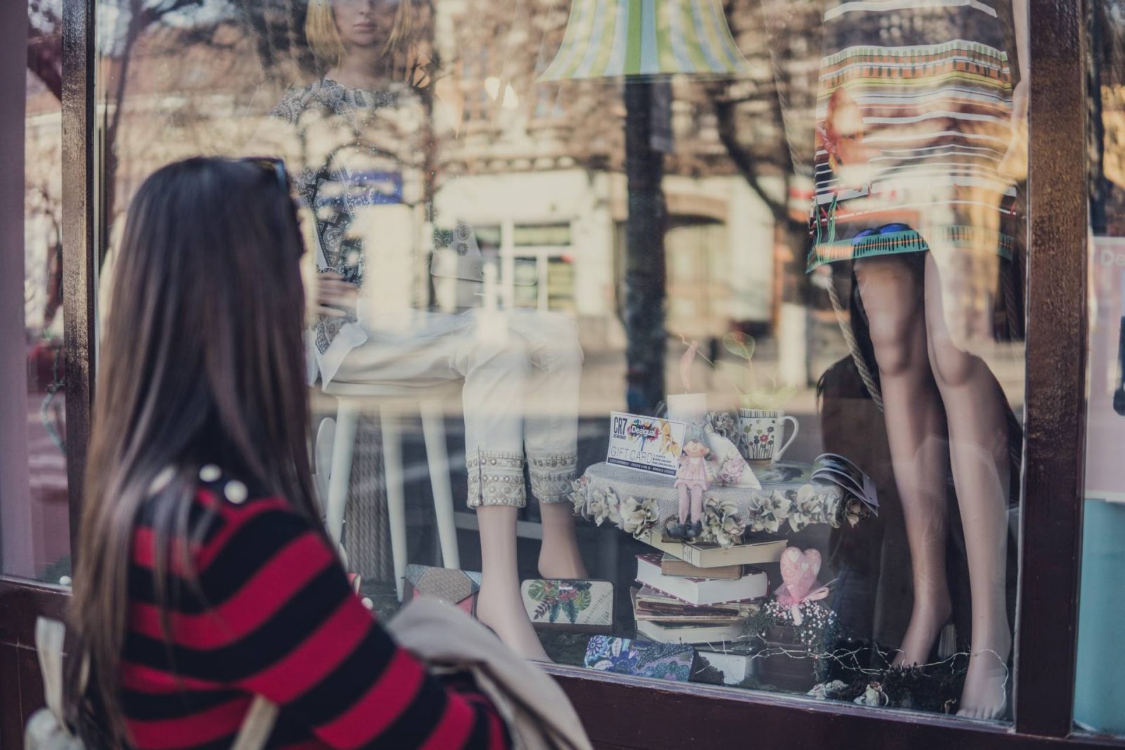
Photo by Gyorgy Bakos on Unsplash
The importance of window displays in boutiques :
With a growing number of smartphone users, a lot of whom spend time on their mobiles when walking down the street, it takes something eye-catching to grab their attention. Surveys have also discovered that as a population, we are walking faster in big cities, often with a destination in mind that we need to reach by a certain time. Window displays must stand out, be aesthetically pleasing and be relevant in order for someone to want to enter the store.
If done well, with a target market in mind, sales and footfall can be maximised. The window of a store is a perfect opportunity for companies to inform passers-by of their brand identity and to differentiate from competitors.
One way to make your window display appealing is through the right lighting. With bad lighting, garments can be seen as something that they are not. For example, a green dress could look blue under certain illuminations and the wash of denim can appear different. Clean lighting can also highlight the quality of the materials in store and make them stand out from garments that are on show in other stores.
Understandably, window displays should be clean and organised. In a boutique, customers expect garments to be neatly on display without the clutter that they might find in a regular high-street store.
The psychology behind visual merchandising :
Of course, there are the obvious traits of a good window display — tidy, colourful and with the garments easy to see. But, there is some psychology behind what attracts visitors to certain store windows.
First of all is the rule of three. Quite self-explanatory, this is where three of something are in the focal point of an onlooker. This could be three mannequins, three shelves or three pairs of shoes. This creates asymmetry in the customer’s view which is more memorable and eye-catching than if there was just two.
Studies have shown that visuals increase message retention by 42%, so it’s important that the message conveyed through the window display is a positive one. This leads us to discuss the ‘pyramid principle’. This concept is that the human eye will always veer to the centre of a picture. Therefore, the focal point — perhaps the on-trend, staple jacket or piece of jewellery — should sit in the centre of the window.
Next is colour and the associations that our brain makes with various hues. For a safe option, stores should use black, white, grey and dark blue as prominent colours in their window, as they are popular and resonate with many retail shoppers. It’s important to still add a pop of colour into the display to avoid it looking drab — this could be through props or clothing garments. As a boutique, red should be avoided to some extent. This is because it is strongly associated with sale and items on offer and this can take customers away from the premium vibes they should be receiving from a boutique. Complementary colours can be used to look aesthetically pleasing — these include red and green, blue and orange, and yellow and purple.
Insights from a boutique retailer :
We asked the Creative Director at Trilogy Stores about their visual merchandising strategies as a boutique:
- Have you noticed a relationship between your window display and the number of visitors that you receive?
Definitely, our window displays have a direct effect on the number of people visiting the stores and does seem to vary depending on the design. We have noticed in-particular that our customers are drawn in by eye catching displays that are focused around colour and print the best. For example, our most recent window campaign featured an exclusive print collaboration we’d run with the brand RIXO London for SS18.
- London is a highly competitive place to own a retail store; how do you ensure that your windows stand out from the rest?
We really try to adapt a fresh approach to our window displays and as a small boutique chain we work hard to always use our own assets and collateral from our own photoshoots instead of relying on brands or ‘stock images’ that might not resonate as well with our customer. We are proud to develop a wide range of Trilogy Exclusives and will always endeavour to feature these prominently in our window displays. This means our customer is getting unique product from her favourite brands that she can’t get elsewhere. We definitely have a ‘signature’ feel to our window displays with use of colour, print and images our customer can identify with. She sees this consistent brand message running through to our website, social media and in store point-of-sale.
- What are your top tips for visual merchandising in a boutique store?
Be confident and know your customer. We like to create eye catching window displays and in store features that are commercially viable with volume product behind them.
Keep it fresh. We do monthly campaigns in our windows but believe updating the product on a weekly basis keeps those regular customers excited and coming back.
Consistency. We like to reiterate the main campaign messages seen in the window throughout the store by using the rails and denim tables as well as consistent imagery, talking points and branding so our customer has confidence in what we are promoting.
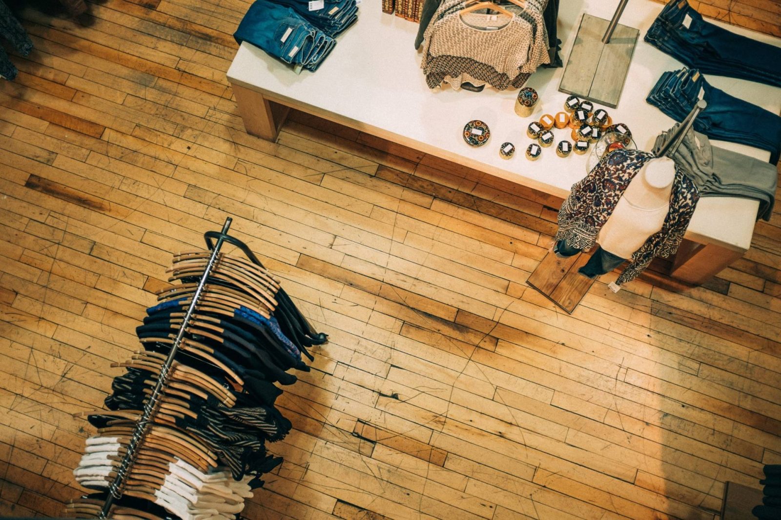
Photo by Ashim D’Silva on Unsplash
Sources :
www.retailgazette.co.uk/blog/2018/03/zara-ups-ante-displays-use-augmented-reality/
www.repsly.com/blog/consumer-goods/visual-merchandising-display-techniques-to-increase-sales
www.telegraph.co.uk/culture/3634141/They-have-ways-of-making-you-spend.html
www.intelligencenode.com/blog/visual-merchandising-matters-ever/
This post complies with my Disclosure Policy
Found this useful wondering how you can show me your appreciation? Well, there are some ways you can say thanks and support my website: ➡

