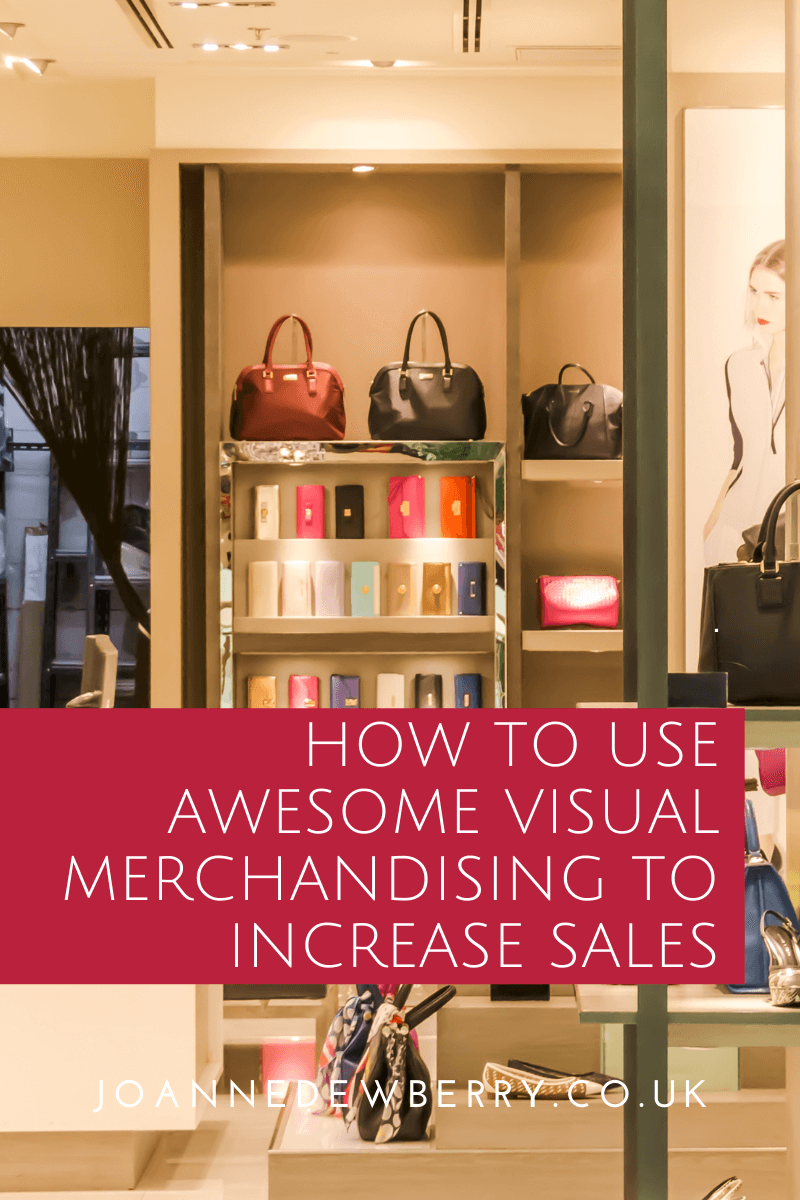
Whatever you sell from clothing to cakes you cannot underestimate excellent visual merchandising and seasonal displays, occasional spending is a big business in retail think Valentine’s Day, Easter and Halloween. Visual merchandising and retail design are powerful tools in influencing consumer behaviour, especially when you have a clear vision of your customers’ needs. But just how can your small business use visual merchandising to increase sales? Here are 3 top tips.

How To Use Awesome Visual Merchandising To Increase Sales:
- Group Different Products on Display: You would never see a mannequin wearing just a t-shirt! The retail design agency is looking to sell you a lifestyle, not just individual things. Therefore mannequins are posed in full outfits, shoes, hats, bags, knowing that seeing these things together will likely inspire the buyer to purchase more than one item. Think about Christmas decorations, the items are “used” a table is set with crockery and decorations, lights are hung, candles are lit, Christmas music is playing, the idea is you look at the items and SEE them in your home. Visual merchandising evokes an emotional response. With visual merchandising for craft fairs we always talk about grouping products in products in groups of 3 or 5 (odd numbers create asymmetry our eyes are drawn to unbalanced displays), this helps to draw the eye and customers’ attention. Group similar items by height, have short, medium, and tall or width, fat, fatter, and fattest, or price by arranging items in order from good, better, and best value to the customer.
- Use Height To Your Advantage: Whether you are selling at a craft fair or own a shop try and maximise impact by elevating products to different levels. Use props, baskets, boxes and wall space to enhance the merchandise and where possible display products at eye level. Don’t forget displays located close to the tills, as this can be your highest sales-generating area, sweets in the supermarket, for example, you are bored and usually waiting, so your focus is on what is displayed around you. Having a proper display in this area will encourage customers to add items to their shopping cart along with their initial purchases.
- Clear Pricing And Signage: Price your products with clean, clear ticketing (point of sale), always ensure each item in the display is priced, when consumers can’t see prices they immediately assume it’s out of their price range. Awesome signage will act as a salesperson within your visual merchandising, never underestimate customers being able to comfortably and confidently reach their desired destination or location just by following the display signs. As a consumer, you know how annoying it is when a supermarket changes its layout and you can’t find what you are looking for! Don’t display “what we need” products at the front or in the window, this won’t entice customers in, ensure these items are at the back, example underwear or bread is normally at the back of the shop so you have to pass lots of other items to get to them. Encourages impulse buying.
Have fun with it too. Visual merchandising is about being creative. What other tips do you have when it comes to visual merchandising to increase sales?
This post complies with my Disclosure Policy.
Found this useful wondering how you can show me your appreciation? Well, there are some ways you can say thanks and support my website: ➡
